Archive
Python: Random Pixel Color – P2
Learning : Python, Math
Subject: Random Coloring Pixels
[NOTE: To keep the code as simple as we can, We WILL NOT ADD any user input Varevecations. Assuming that our user will Enter the right inputs.]
Our last post about Random Pixel Color, we generate a Numpy Array of Row, Coloum and color then we Plot it on the screen [Read the Post Here], now in this post we will use some Math consepts to try if we can get some patterns out of ramdom Function.
Our Tools: In this post we will use the following:
1. Jupyter-NoteBook.
2. numpy.
3. random.
4. matplotlib.
5. PIL or Pillow.
In this version we will use “Fibonacci Sequence” Fibonacci Sequence is the sum of the two preceding ones, starting from 0 and 1 such as [1, 1, 2, 3, 5, 8, 13 … n], in our code we will have three variables:
cw: canvas width,
ch: canvas hight,
offset: the offset will be the value that will reset the Fibonacci Sequence to 1.
So, if we run the application, we will generate three numbers that will present the colors R,G,B (Will be Generated ONE time) then for each pixcel in (cw*ch) we will calculate a v as Fibonacci Sequence from fs1 =1, fs2 = 1 here is the code:
v = fs1 + fs2
fs1,fs2 = fs2, v
this value v will be added to the colors r,g,b (on each pixcel) untill the v is grater the the offset numbre that we pass to the Function. If v > offset then we will re-set the fs1 = 1, fs2 = 1,.. Here is the Code ..

|
Run No.1 |
Run No.2 |
Run No.3 |
Run No.4 |
The above is just 25×25 and i change the offset, feel free to download the code and change the numbers .. see what you will get …
..:: Have Fun with Coding ::.. 🙂
To Download my Python code (.py) files Click-Here
 Follow me on Twitter..
By: Ali Radwani
Python: Data Visualization Part-2
Learning : python, pygal, Data Visualization,Line Chart
Subject: Data visualization using pygal library
In this post we will talk about Line-chart using pygal library in python, Line-chart has three sub-type as: Basic, Stacked ,Time. We will use the data-set for Average age of Males and Females at first Marage during 6 yeaars (2000 and 2006), the code line to set the data data will be as :
line_chart.add(‘Females’,[22,25,18,35,33,18])
line_chart.add(‘Males’, [30,20,23,31,39,44])
Line-chart: Basic
This is very normal and basic chart we use in all reports, we are feeding the data for Males and Females average age in first marage.. here is the code and the output ..
import pygal

line_chart = pygal.Line()

line_chart.add('Females',[22,25,18,35,33,18])
line_chart.add('Males', [30,20,23,31,39,44])

line_chart.x_labels=map(str,range(2000,2006))

line_chart.title = "Males and Females first Marage Age (average)"

line_chart.render()
 |
Line-chart: Stacked Line Stacked chart (fill) will put all the data in top of each other. Here is the code.
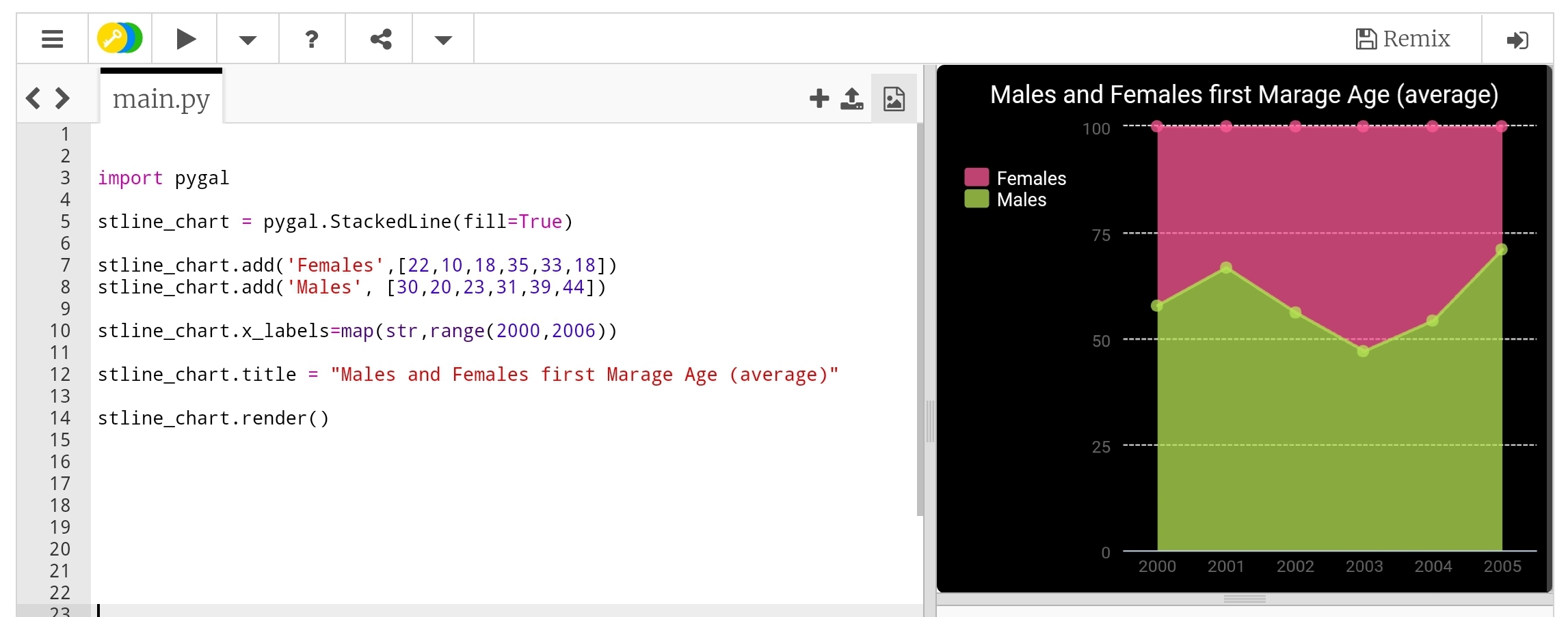 |
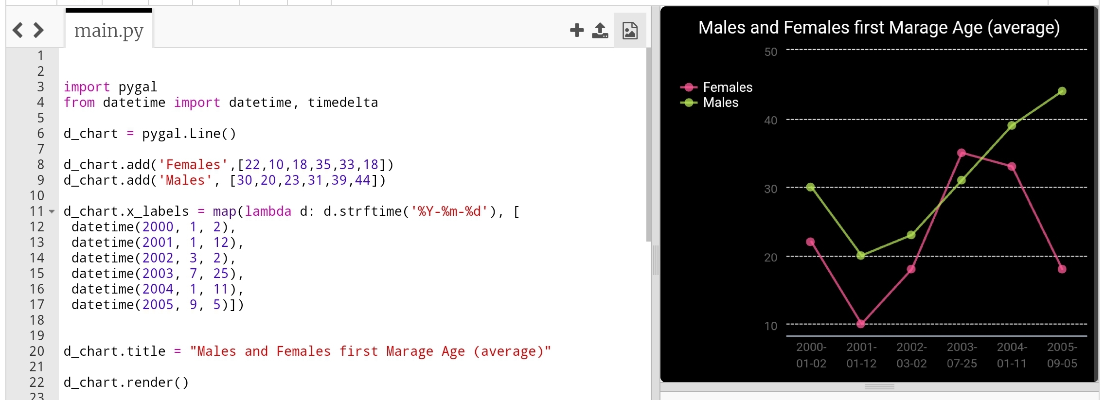
Line-chart: Time Line Last type just to add or format the x_lables of the chart, we can use lambda function to do this (we can use lambda function with any other chart types), here we will do two example, one is using full time/date and another just write the month-year as string and will use the lambda function to calculate second data-set of Tax’s based on the salary amount..
import pygal
from datetime import datetime, timedelta

d_chart = pygal.Line()

d_chart.add('Females',[22,25,18,35,33,18])
d_chart.add('Males', [30,20,23,31,39,44])

d_chart.x_labels = map(lambda d: d.strftime('%Y-%m-%d'), [
 datetime(2000, 1, 2),
 datetime(2001, 1, 12),
 datetime(2002, 3, 2),
 datetime(2003, 7, 25),
 datetime(2004, 1, 11),
 datetime(2005, 9, 5)])

d_chart.title = "Males and Females first Marage Age (average)"

d_chart.render()
 |
To give better example of using lambda function, we will say: we have a salaries for 6 years (May-2000 to May-2006) and a Tax of 0.25, we will let the lambda function to calculate the Tax amount for each salary. Here is the code ..
 # Using lambda to calculate Tax amount

import pygal

d_chart = pygal.Line()

d_chart.add('Salary', [550,980,1200,1800,2200,3500])

d_chart.add('Tax',map(lambda t: t*0.25, [550,980,1200,1800,2200,3500]))
d_chart.x_labels = map(str,(
  'May-2001','May-2002',
  'May-2003','May-2004',
  'May-2005','May-2006'))

d_chart.title = "Salary and Tax (0.25) payment in 6 years"

d_chart.render()
 |
Next we will talk about Histogram chart.
:: Data Visualization using pygal ::
| Part-1Bar-Chart | Part-2 Line Chart | Part-3 | Part-4 |
By: Ali Radwani
Python: Data Visualization Part-1
Learning : python, pygal, Data Visualization, Bar Chart
Subject: Data visualization using pygal library
pygal is a Data Visualization library in python to help us showing our Data as a graph. In coming several posts we will discover and learn how to use the pygal library in simple and easy configuration and style.
First we need to install pygal packeg, to do so write this:
pip install pygal
Now we need some Data to show, in this leson I am using aGalaxy Tab S4, so all the codes will be tested and applyed on trinket.io website [trinket.io alow us to use pygal package online so we don’t need to install it on our divice]
Type of Chart:
pygal has several types of charts that we can use, here we will list them all then in coming posts will use each one with simple data. So what we have:
Line, Bar, Histogram, XY, Pie, Radar, Box, Dot, Funnel, SolidGauge, Gauge, Pyramid, Treemap, Maps
Some of those charts has a sub-types such as in Bar char we have: Basic, Stacked and Horizontal. Also for each chart we can add a title and labels and we can use some styles.
So let’s start ..
First we will go for the Bar chart, and we have three sub-types as Basic, Stacked and Horizontal.
First chart: Bar chart:
In this part we will demonstrate the Bar Chart, it has three sub-types as Basic, Stacked and Horizontal.
We assume that our data is the Males and Female ages on first marage, the data will be as dictionary (later we will see how to customize each bar)
 # Basic Bar Chart using pygal

import pygal
bar_chart = pygal.Bar() # To create a bar graph object
bar_chart.add('Females', [22,25,18,35,33,18])
bar_chart.add('Males', [30,20,23,31,39,44])

bar_chart.title = "Males and Females First Marage Age"
bar_chart.x_labels=(range(1,6))

bar_chart.render()
Sample code for Basic bar chart |
Another sub-type in Bar chart is Horizontal-Bar, it is semelar to the Basic but as if fliped 90 degree. Here is the code ..
 # Horizontal Bar Chart using pygal

import pygal

# HorizontalBar()
HBar = pygal.HorizontalBar()
HBar.add('Females', [22,25,18,35,33,18])
HBar.add('Males', [30,20,23,31,39,44])

HBar.title = "Males and Females First Marage Age"

HBar.x_labels=(range(1,6))

HBar.render()
Sample code for Horizontal Bar chart |
Last sub-type in Bar chart is Stacked Bar were all data of each element will be in one bar. Here is the code and example..
 # Stacked Bar Chart using pygal

import pygal
# StackedBar()
stackedbar = pygal.StackedBar()
stackedbar.add('Females', [22,25,18,35,33,18])
stackedbar.add('Males', [30,20,23,31,39,44])
stackedbar.x_labels=(range(1,0))
stackedbar.title = "Males and Females First Marage Age"

stackedbar.render()
If we say we have another data-set as “age in First-Divorces” and we want to add this set to the Stacked Bar chart, then we first will create the data-set as:
stackedbar.add(‘Divorses’, [35,22,45,33,40,38])
and we will arrange the code line to be at top,middle or bottom of the bar. Here is the code..
Sample code for stacke Bar chart with Divorce data
|
Next we will talk about Line chart.
:: Data Visualization using pygal ::
| Part-1Bar-Chart | Part-2 | Part-3 | Part-4 |
By: Ali Radwani
Python ploting
Learning : Plotting Data using python and numpy
Subject: Plotting Data
The best way to show the data is to make them as a graph or charts, there are several charts type and names each will present your data in a different way and used for different purpose. Plotting the data using python is a good way to show out your data and in coming posts we will cover very basic aspects in plotting data. So if we just want to show a sample for what we are talking about, we will say: we have a sample of hospital data for born childs (male m, female f, in years 200 to 2003).
:: Click to enlarge :: 
|
There are some libraries we can use in python to help us plotting the data, here are some of them. Matplotlib, Plotly and Seaborn are just samples of what we may use, in this post we will use the Matplotlib. To use Matplotlib we need to install it, so if it is not installed in your python you need to do so.
pip install Matplotlib
Then we need to import it in our code using :
import matplotlib.pyplot as plt
To show the data we need to have some variables that will be used in our first example, So the case is that we have some data from a hospital, the data are numbers of born childs (male m, female f) in years 2000 to 2003. We will store/save the data in list, we will have data_yesrs =[2000,2001,2002,2003], then we will have male born data in data_m=[2,2.5,3,5] and female born data data_f = [3,3.8,4,4.5], the chart will have two axis vertical is Y y_data_title =’In Hundreds’ and horizontal is X x_data_title =’ Years’, now to project all this information on a chart we use this code ..
import matplotlib.pyplot as plt
data_yesrs = [2000,2001,2002,2003] # years on X axis
data_m = [2,2.5,3,5]   # y data males born
data_f = [3,3.8,4,4.5]  # y data female born
y_data_title ='In Thousands'
x_data_title =' Years'

plt.title('New Born babies')

plt.plot(data_yesrs,data_m,'r-', data_yesrs,data_f,'b--')
plt.ylabel(y_data_title)
plt.xlabel(x_data_title)
plt.show()
Another way to plot the data were we can use a one line for each data set as:
plt.plot(data_x,data_m,’r-‘)
plt.plot(data_x,data_f,’b–‘)
We can see that male data is red line, and female data is blue dashes, we can use some line style to present the data as mentioned bellow:
‘-‘ or ‘solid’ is solid line
‘–‘ or ‘dashed’ is dashed line
‘-.’ or ‘dashdot’ is dash-dotted line
‘:’ or ‘dotted’ is dotted line
‘None’ or ‘ ‘ or ” is draw nothing
And also we can use colors such as :
r: red, g: green,
b: blue, y: yellow .
If we want to add the map or chart key, we need first to import matplotlib.patches as mpatches then to add this line of code:
plt.legend([‘Male’,’Female’])
and the keys [‘Male’,’Female’] MUST be in the same sequence as the main plot code line :
plt.plot(data_yesrs,data_m,’r-‘, data_yesrs,data_f,’b–‘)

|
To Download my Python code (.py) files Click-Here
Taking pictures is not my main daily practices, but when i start playing with my camera, i really enjoy my self.
Thanks for visiting my Space..


