Python ploting
Learning : Plotting Data using python and numpy
Subject: Plotting Data
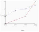
The best way to show the data is to make them as a graph or charts, there are several charts type and names each will present your data in a different way and used for different purpose. Plotting the data using python is a good way to show out your data and in coming posts we will cover very basic aspects in plotting data. So if we just want to show a sample for what we are talking about, we will say: we have a sample of hospital data for born childs (male m, female f, in years 200 to 2003).
:: Click to enlarge :: 
|
There are some libraries we can use in python to help us plotting the data, here are some of them. Matplotlib, Plotly and Seaborn are just samples of what we may use, in this post we will use the Matplotlib. To use Matplotlib we need to install it, so if it is not installed in your python you need to do so.
pip install Matplotlib
Then we need to import it in our code using :
import matplotlib.pyplot as plt
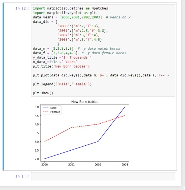
To show the data we need to have some variables that will be used in our first example, So the case is that we have some data from a hospital, the data are numbers of born childs (male m, female f) in years 2000 to 2003. We will store/save the data in list, we will have data_yesrs =[2000,2001,2002,2003], then we will have male born data in data_m=[2,2.5,3,5] and female born data data_f = [3,3.8,4,4.5], the chart will have two axis vertical is Y y_data_title =’In Hundreds’ and horizontal is X x_data_title =’ Years’, now to project all this information on a chart we use this code ..
import matplotlib.pyplot as plt
data_yesrs = [2000,2001,2002,2003] # years on X axis
data_m = [2,2.5,3,5]   # y data males born
data_f = [3,3.8,4,4.5]  # y data female born
y_data_title ='In Thousands'
x_data_title =' Years'

plt.title('New Born babies')

plt.plot(data_yesrs,data_m,'r-', data_yesrs,data_f,'b--')
plt.ylabel(y_data_title)
plt.xlabel(x_data_title)
plt.show()
Another way to plot the data were we can use a one line for each data set as:
plt.plot(data_x,data_m,’r-‘)
plt.plot(data_x,data_f,’b–‘)
We can see that male data is red line, and female data is blue dashes, we can use some line style to present the data as mentioned bellow:
‘-‘ or ‘solid’ is solid line
‘–‘ or ‘dashed’ is dashed line
‘-.’ or ‘dashdot’ is dash-dotted line
‘:’ or ‘dotted’ is dotted line
‘None’ or ‘ ‘ or ” is draw nothing
And also we can use colors such as :
r: red, g: green,
b: blue, y: yellow .
If we want to add the map or chart key, we need first to import matplotlib.patches as mpatches then to add this line of code:
plt.legend([‘Male’,’Female’])
and the keys [‘Male’,’Female’] MUST be in the same sequence as the main plot code line :
plt.plot(data_yesrs,data_m,’r-‘, data_yesrs,data_f,’b–‘)

|
To Download my Python code (.py) files Click-Here
 Follow me on Twitter..

